The app must feel different from the Website
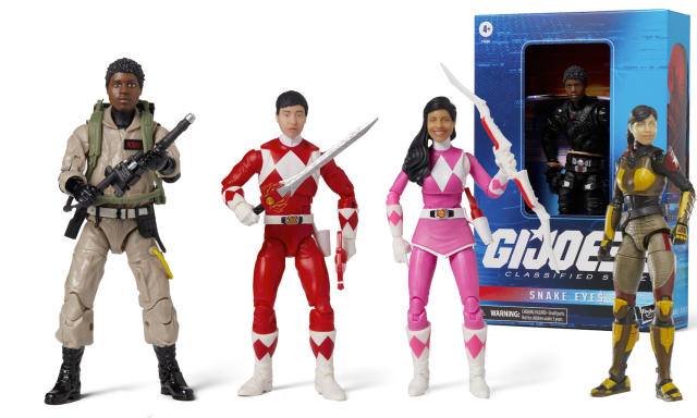
The project came as the need for a wrapper for the “Hasbro Pulse Selfie Series” app, which is an initiative for action figures personalization (12” action figure toys). The request was to design an app for the Hasbro Pulse, which is an online store for the fans, collectors and “kid-ults” in general. Inside this app, one of the main features is “Selfie Series”. The market segment is different from the traditional Hasbro family store, so it must show the distinction between the two online services. The products here can range between $20 to $600 easily, while on the other price ranges could be $10 to $100. Also, it must avoid cannibalization between the website and the app, since the website is already optimized for mobile. Another condition is that the app must convey a “premium” feeling, where the user find value for pricey purchases.
An e-commerce app with an avatar configurator for physical action figures that must feel premium.

RESEARCH
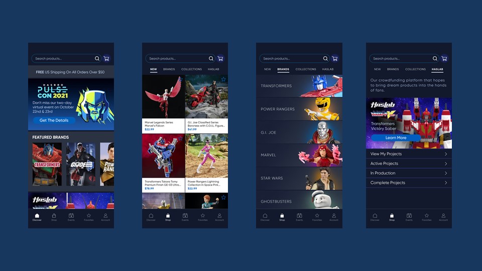
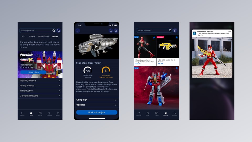
The app has several sections with different functionalities:
“Discover”: for miscellaneous announcements and products with a single infinite scroll column and big images; more visual, eye catching.
“New” for all the latest “drops” or products in the tile format, to show more product in shorter time.
“Brands: which is the core of the Fans search, they generally come to this app with a favorite brand on mind but could lead to see other interesting things in other brands, like crossovers.
“Collections”: groups of products made in partnership with other companies or within a specific event.
“HasLab”: the crowdsourcing service, which the most daring products are proposed to the audience.
“Favorites”, where the user can save their favorite products for a posterior purchase.
“Search and filters” were also refined for mobile.
“Account” for admin and announcements purposes.
“Cart and checkout” which is one of the most important sections of the app because is where the user must be directed to a successful final buy.
All these sections were constantly reviewed by the leads of their areas, thanks to digital tools like Adobe XD, which were easy to share and have constant review on wireframes and flows. We were able to test different flows and constantly refine the UX. Even with external partners and agencies, which provided feedback and additional knowledge.
Trends: Dark mode and light mode were trending on many apps, and we did our own take at it. Instead of relying on two color schemes, the UI was designed with a color scheme that was good enough in contrast and easy for readability, feels premium and makes a brand statement for differentiation.
Also, considering avoiding high contrast since some user studies mention the high contrast can be prone to generate migraines on some users.
One important branding element is the product shot photos: the app spartan look allows to show off the colorful action figures and dioramas; for the visual appeal. The plastic, toy, “stop-motion-like” look of the products is the main star and is always the highlight along the different sections.
Here are some screens related to the project.
Click on the images to make them bigger


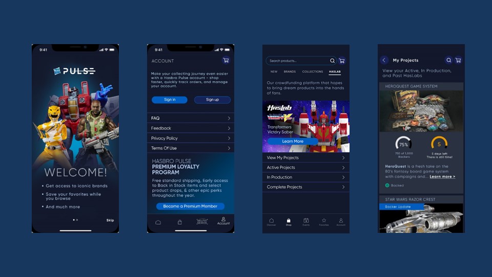

Pulse app design is reusing visual elements from the website, like brand colors, icon library and fonts. I found the need to add some accessibility features to the product through considering high contrast, and a color scheme that is not too intense that also could work for color blind conditions.
This app is designed for adults, not kids; a segment for fan collectors known as “kid-dults”, therefore, it needs to have an adult appeal showing a prime quality look but still being fun and functional. Color scheme is in brand without becoming too minimalistic or austere but simple enough to make the product the main point of attention.
For accessibility, it was considered a high contrast for visibility and legibility (for low vision conditions) but also, a resting color scheme (considering avoiding migraines). Works on outdoor illumination conditions.
The color palette is considered for different color-blind conditions (Deuteranopia, Protanopia, Tritanopia, achromatopsia). Next features are implemented like Alt tags for images for the text to speech readers and Close Captions for videos
DESIGN SYSTEM

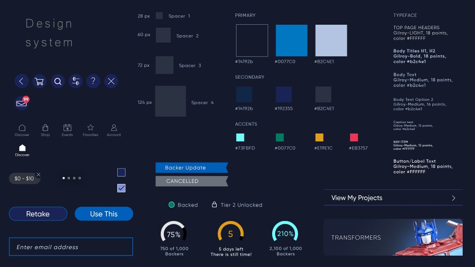
The Pulse App Design system reuses visual elements from the website, like brand colors, icons and fonts. It’s a system that can be used as the foundation bricks to build any screen or to extend more sections.
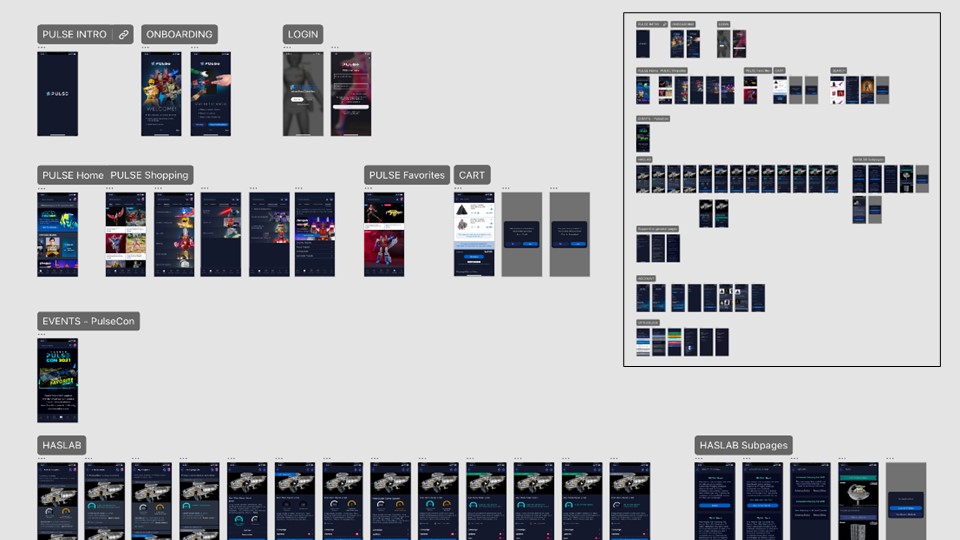
As documentation we used Wireframes, Flow Charts in Adobe XD and general guidelines for development in confluence, Debug sheets, User cases scenarios, and Video when possible. Storyboarding for video pieces or special banners.
Here is a partial view of the Adobe XD document flowchart:
• The smaller font size was picked to be legible and avoiding to be too small, since the audience is mainly adults.
• High contrast between titles and subtitles to have a clear hierarchy on the sections and subsections
• Incorporated the thin version of the default font added the perception of high value since the segment is the fan adult.
• The Pulse app has a lean design navigation to avoid too many steps keeping it simple.
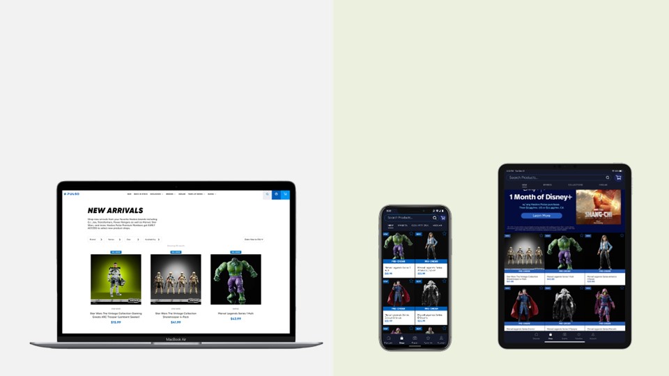
• With a form factor that works for smartphones and tablets.
Track Learnings And Evolve
The process is carried out on every user testing session
• Capture feedback from user testing sessions
• Evaluate criteria selection
with the group; gather the common observations
• Consolidate conclusions from the UX researchers
• Apply changes to mockups
Through constant feedback and fast iterations, we were able to refine continuously. Three or more large user sessions were conducted to understand the perception and usability of the app. Constantly putting it front of the leads and several adjustments were made.
After the initial launch, we collected the live user feedback and implemented immediately, the iterations were done quick in 2 weeks cycles at the most. In some cases, it takes more time, like in the “orders” section where we had to adjust the scrolling list to show images and allow more than 50 products in some cases, as per customer requests.
